Rosmarino's Ristorante
A minimalist restaurant branding concept inspired by classic Italian typography and contemporary editorial design. The wordmark combines elegant letterforms, refined spacing, and a timeless aesthetic to create a sophisticated yet approachable visual identity.
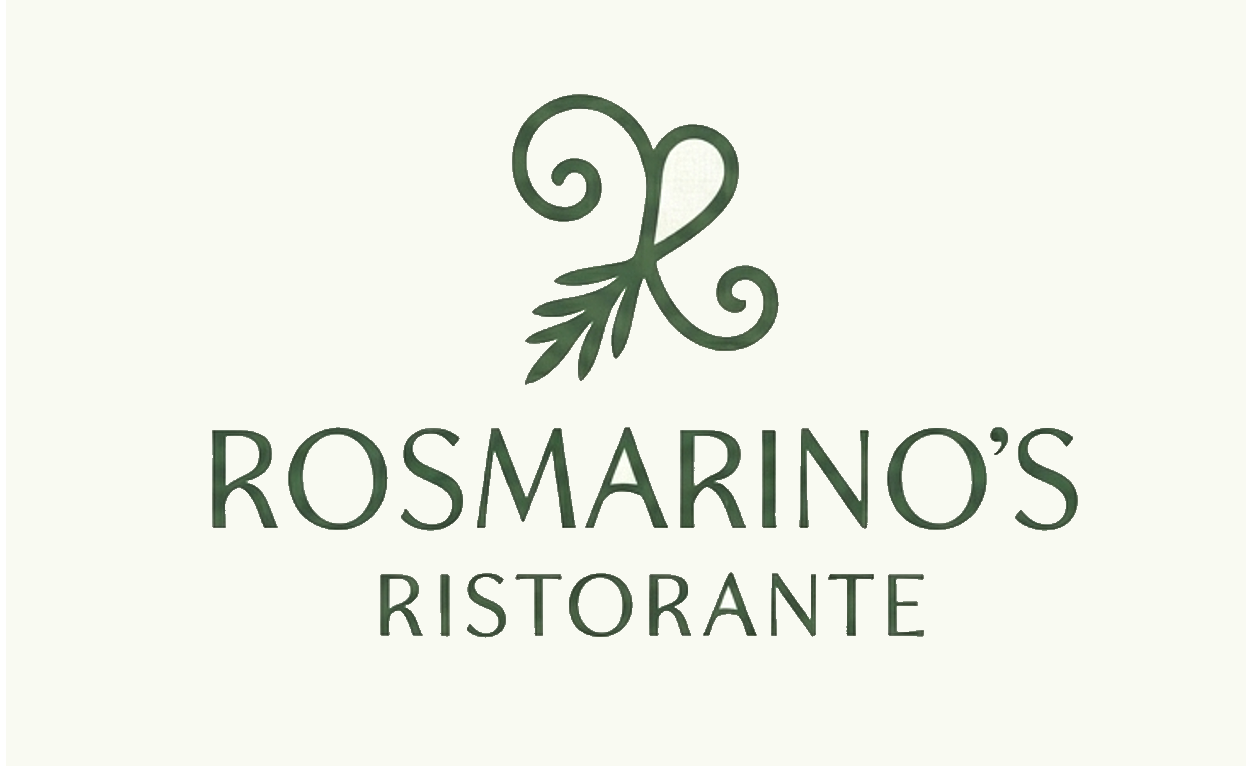
Primary Logo
The core mark introduces the Rosmarino's Ristorante identity with a clean and memorable logo treatment. It is presented first as the main visual anchor of the brand system.

Logo sketch
Sketch doodle of the resteraunt logo.
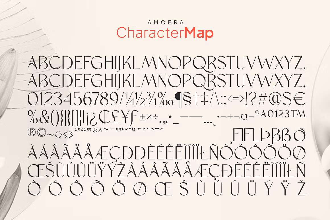
Typography
This spread highlights the typography choices and how they support the brand's tone through hierarchy, spacing, and consistency.
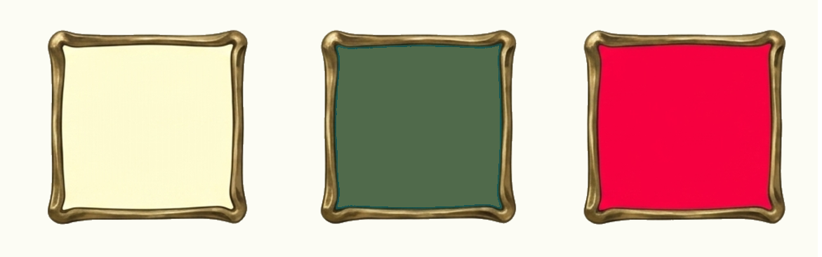
Color Palette
saffron cream, nautilus teal and Hibiscus flame
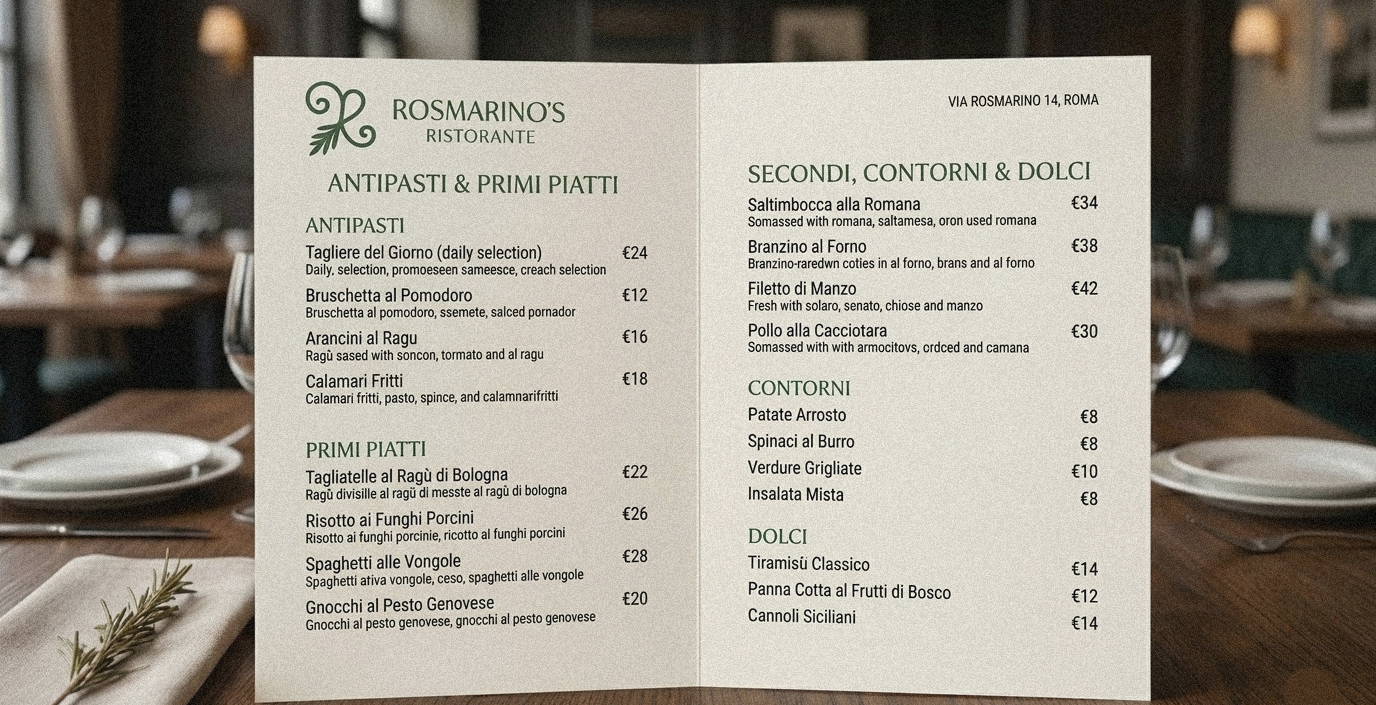
Menu Design
The menu application extends the identity into a functional restaurant touchpoint, balancing elegance with readability.

Polo & apron design
mockup design of the logo printed for working attire.
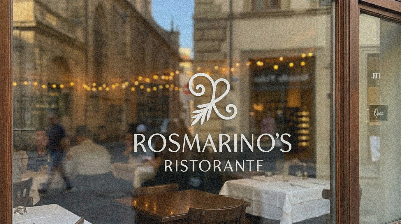
Logo on glass window
The glass window mockup demonstrates how the logo works in a real-world restaurant setting and adds presence to the space.
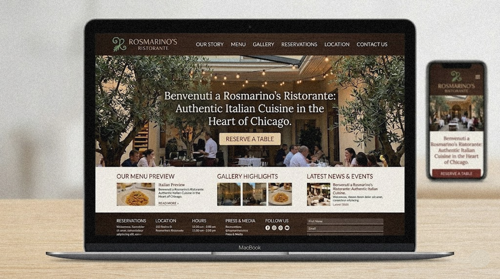
Web Page
Mockup design of the website of Rosmarino's Ristorante.
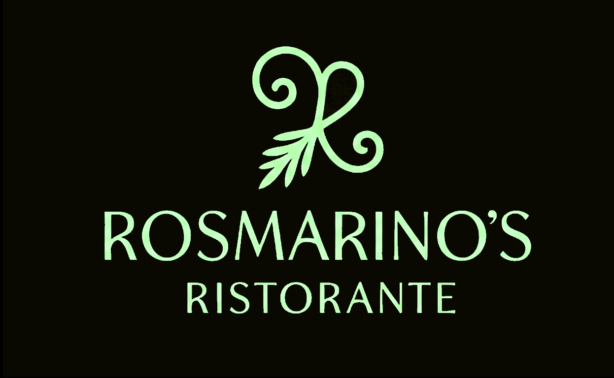
Alternate Application
A darker variation of the logo presentation, used to show flexibility across materials and visual contexts.