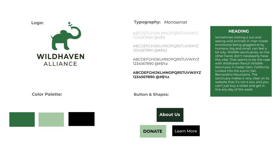
Wildhaven Alliance | Brand Identity & Logo Design
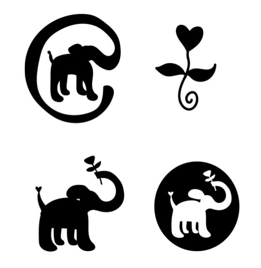
Wildhaven Alliance is a brand identity project for a conceptual non-profit focused on wildlife refuge and nature conservation. The visual centerpiece is a minimalist elephant silhouette, designed with organic curves and a symbolic "heart-rose" motif held in its trunk to represent the intersection of nature and care. Using green for the logo is a natural fit; it instantly connects the brand to the environment without needing any explanation.
Wildhaven Alliance Logo
The primary logo features a minimal elephant silhouette designed for clarity and versatility. Its rounded form communicates warmth and protection, while the upward trunk integrates a small leaf element, symbolizing renewal and the interconnectedness of life. The mark is designed to function effectively across both digital and print applications.
Process Sketches
These initial sketches explore different ways of experimenting the elephant with organic and symbolic elements. Variations focus on composition, shape simplification, and how the plant interacts with the elephant’s trunk. The goal was to find a balance between scalability and meaning, leading to a clean icon that feels both approachable and meaningful.
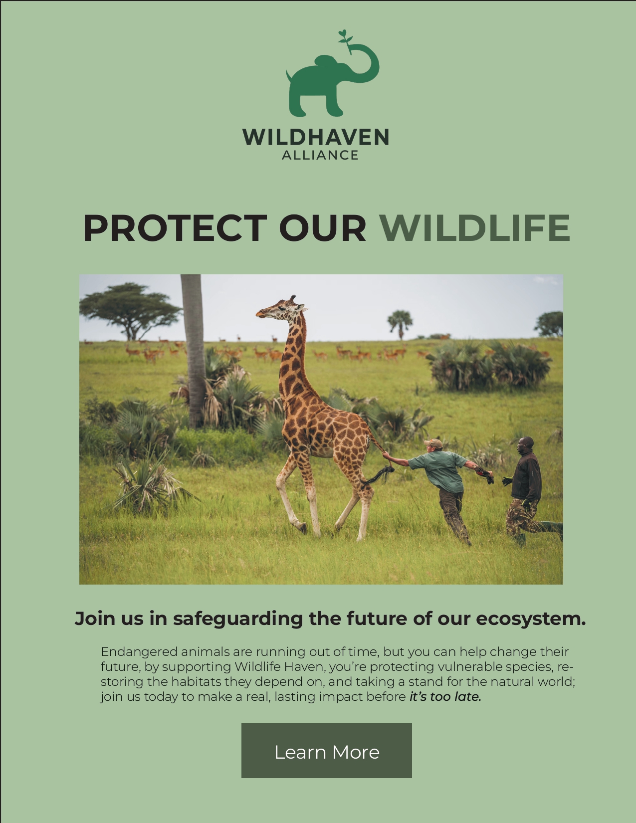
Email Banner
An application of the Wildhaven identity within a publication format. The design demonstrates how the brand extends into editorial use, combining imagery, typography, and the logo to create a cohesive and engaging visual narrative that aligns with the organization’s mission.
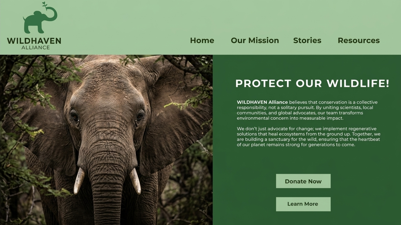
Web Page Mock-up
The website mock-up presents the identity in a digital environment, showing how the brand adapts to interface design. It emphasizes usability, visual consistency, and a calm presentation that reflects the organization’s values.

Business Card
The business card translates the identity into a compact, professional format. Clean typography and restrained spacing reinforce the brand’s sense of clarity, while the logo remains the primary visual anchor.
Moodboard
The moodboard gathers visual references that shaped the identity direction, including natural textures, soft organic forms, and conservation-inspired imagery. It establishes the emotional tone of the brand and informs the overall visual language.
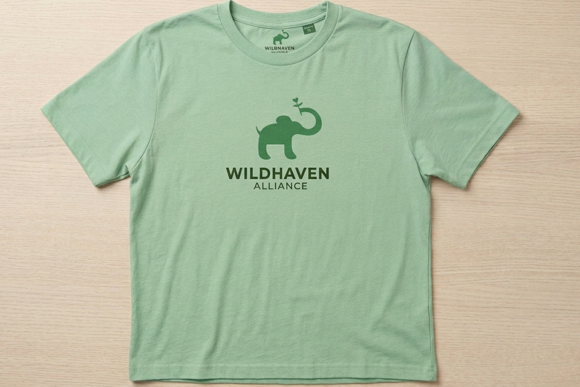
T-Shirt
The T-shirt application gives the identity a wearable form, turning the logo into a recognizable piece of brand merchandise. The layout keeps the design simple so the mark remains bold and legible.
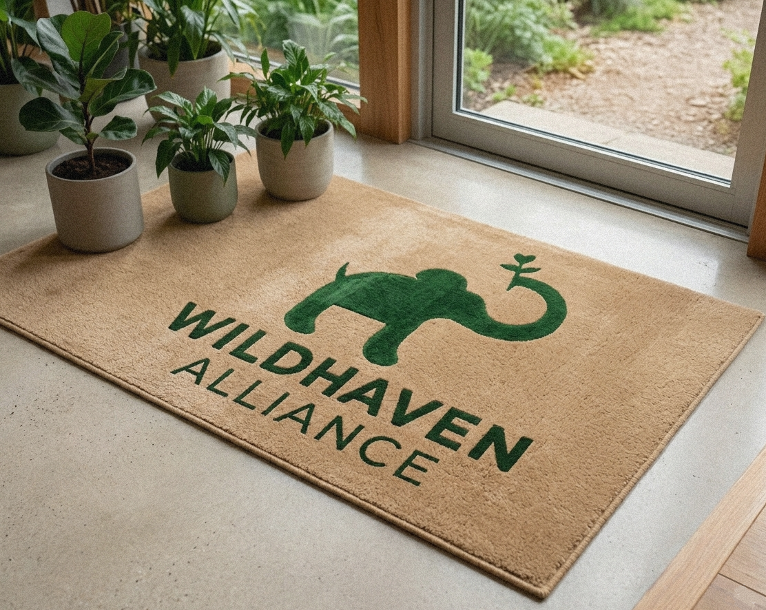
Rug Carpet
This mockup extends the identity into a tactile interior object. The larger format helps show how the logo can hold up as a bold environmental graphic while still feeling soft and connected to the brand.
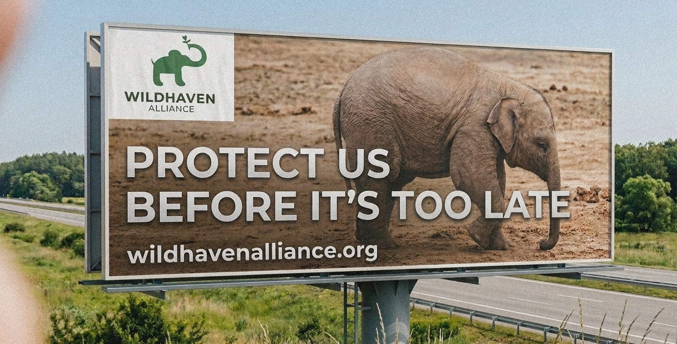
Billboard
The billboard application is designed to present the identity at a larger scale, where hierarchy and contrast matter most. It gives the brand a public-facing presence with strong recognition from a distance.
Email Banner
The banner adapts the identity for digital outreach and promotional communication. It keeps the system clean and readable while reinforcing the brand across everyday nonprofit touchpoints.
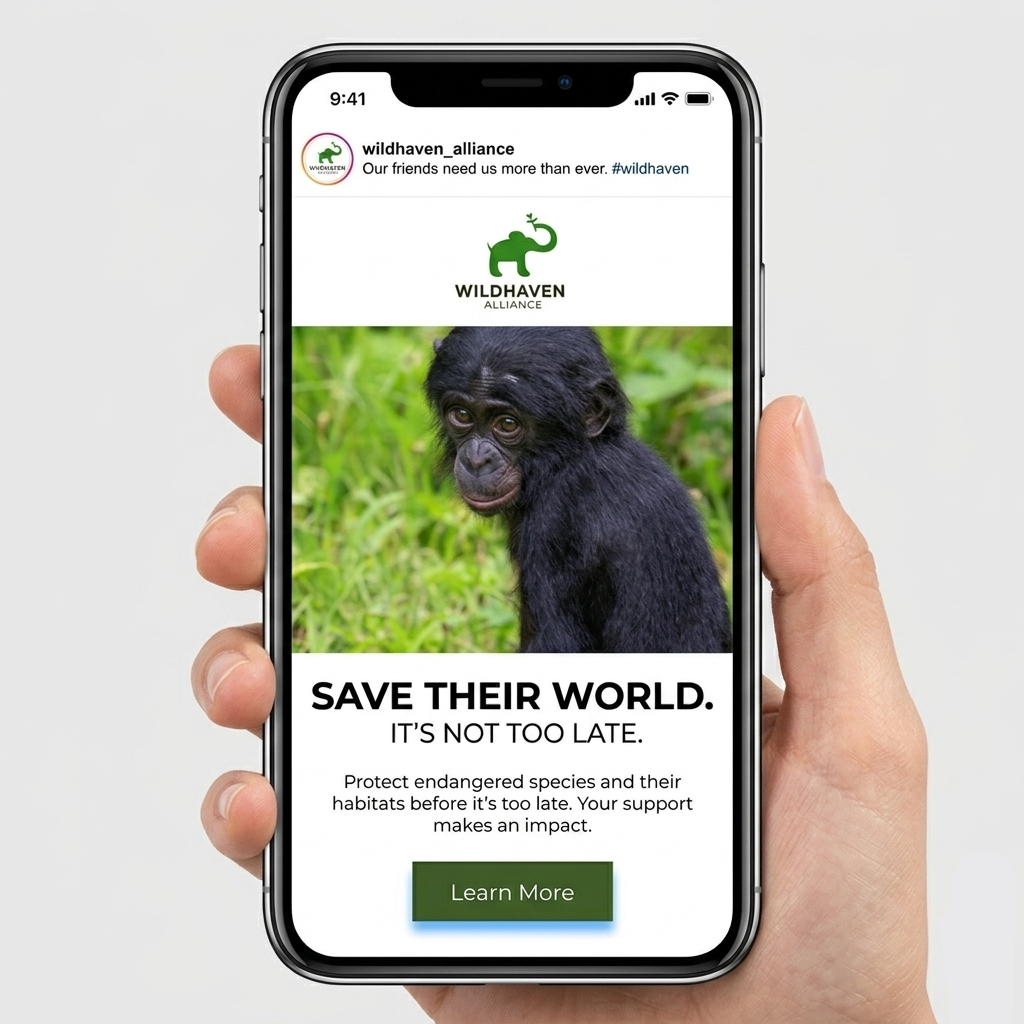
Instagram Ad
The social format shows the identity in a fast-moving, mobile-first context. Its composition is built to attract attention quickly while staying consistent with the larger visual system.
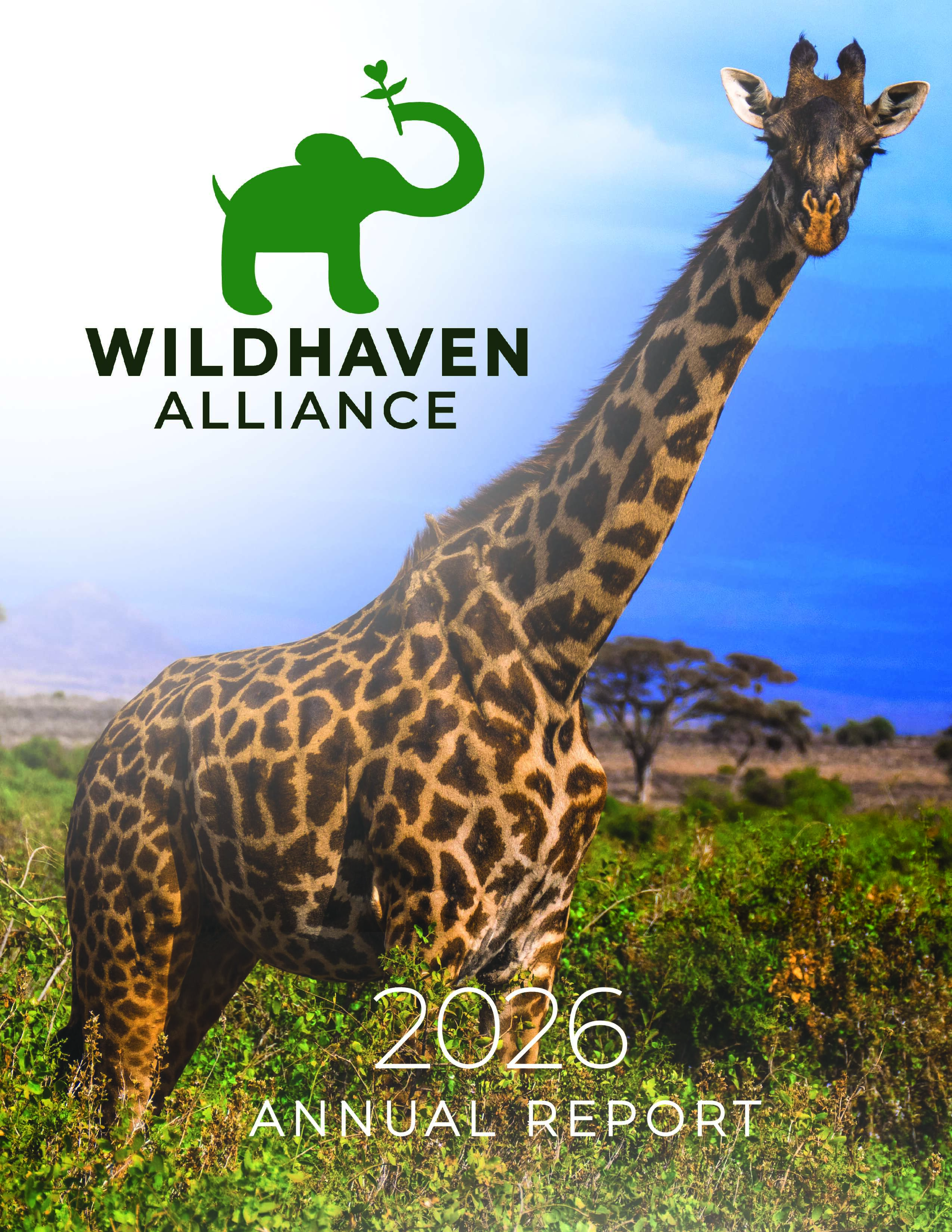
Annual Report
The annual report presents the identity in an editorial format and reinforces the brand across print materials.